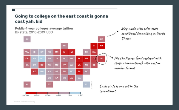
There's something comforting about the how clean a tile grid map looks. I usually see these for the US because of how the states are oriented, but there are examples of other ones like the EU.
Using Google Sheets
I wanted to make a US tile grid heat map but didn't want to load up and (re)learn some specialized software or tools. Since spreadsheet cells are already "tiles" I figured hacking Google Sheets a bit would get me what I wanted.
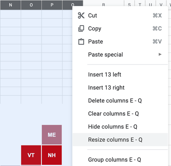
Sizing the cells so they're squares
Resizing columns and rows is pretty straight forward. You select the columns or rows you want to resize and right-click to pull up a fairly long menu. In that menu you choose "Resize columns". I went with size 50, but you do you. Set the rows to the same size, so in my case 50.
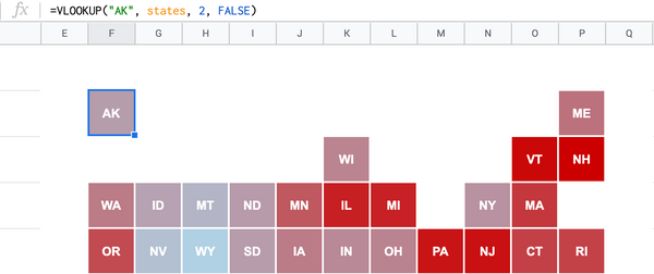
VLOOKUP the data for each cell that will represent the state
The VLOOKUP will pull in the numerical data that will be used to set the color of the heatmap
=VLOOKUP("AK", states, 2, FALSE)
- This formula is looking up the state "AK"—Alaska—from the range, which I named
statesusing "Named ranges", and pulling in the numerical data which is in column 2 of the range - I could have just inputed a figure in the cell for "AK" but that just makes it more difficult to update if my data changes
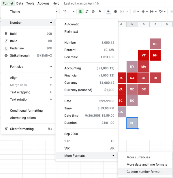
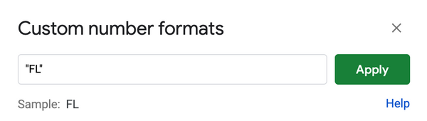
Hide the figure in the cell and replace with the state abbreviation using "Custom number format"
In my final map each cell shows the state abbreviation, not the figure the VLOOKUP pulled in. To achieve this is a bit of a tedious hack, but once you have the template setup you won't have to do it again. Select the cell for the state that you want to label. Then go to Format > Number > Custom number format. In quotations type in the text you want to use, i.e. "FL" for Florida, and hit "Apply". Do this for the rest of the states...or you can make a copy of my spreadsheet
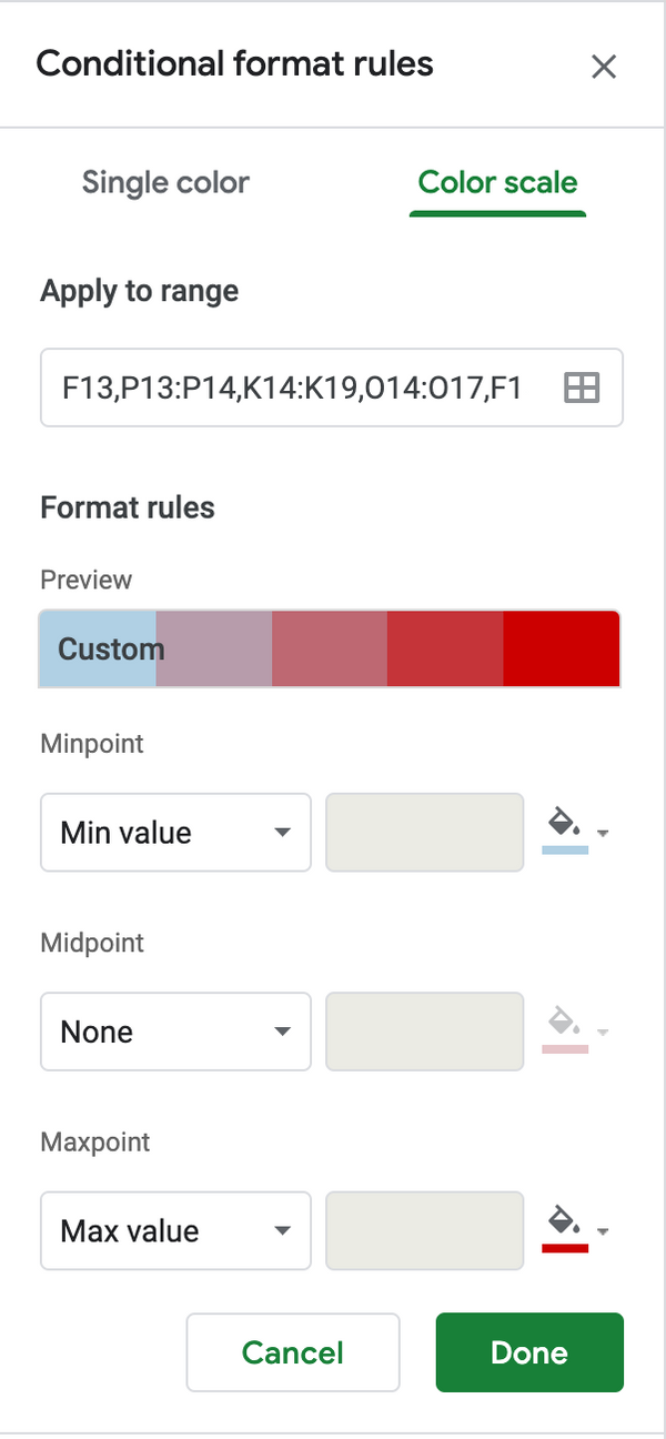
Fill the cells with conditional formatting
Select all the cells that represent the states (using CMD + Click or Ctrl + Click) then go to Format > Conditional formatting. Select the tab "Color scale" and tweak your "Minpoint", "Midpoint", "Maxpoint" values and colors as desired.
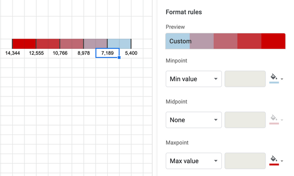
Creating a legend
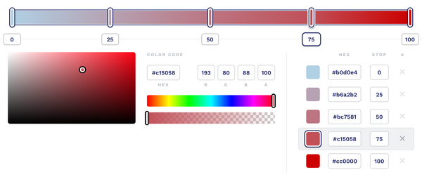
This is the difficult part, and depends on how you've set the "Minpoint", "Midpoint", "Maxpoint" values. Since I set my "Minpoint" and "Maxpoint" as the "Min value" and "Max value" respectively, I can pull those values from my data. For the values in between, take the difference between the min and max value from the data and divide by 5 since Google Sheets gives 5 color stops. Each color stop equates to a 1/5 increment from the min value. To get the colors, I used the color picker tool in macOS, but you could take the "Minpoint" and "Maxpoint" colors you chose and use a gradient tool like this to get the stops
Putting map and legend together
I chose to copy and paste the map and legend separately into a Google Slide so I can line things up and add additional annotations